 Web design, like any other form of art, is subjective by nature. Some people prefer bold, colorful designs, whereas other prefer more flat, simplistic designs. While professional web designers will constantly argue over the “best” color scheme and style, there are certain outdated trends that nearly every designer will agree needs to go.
Whether you’re looking to launch a new website or redesign an existing one, you’ll want to avoid the following design trends. Granted, most of these trends were once useful, they’ve since been replaced with newer, more effective trends. Failure to adapt the latest web design trends will result in your site going the way of the dinosaur.
#1) Flash Animation on Homepage
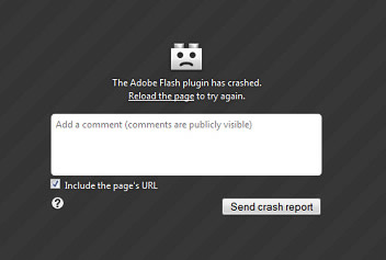
Avoid the temptation of adding flash animation to your homepage. Regardless of how cool it looks, it’s typically not worth the loss of traffic. If someone attempts to access your homepage without having Adobe Flash Player installed, it will produce an error message on their screen; thus, increasing the likelihood of them of exiting your site and taking their business elsewhere.
And since search engines are unable to read flash animation, they won’t know what your homepage is about. This creates a barrier of confusion that may negatively impact your site’s ranking.
A faster, more efficient, and universally compatible alternative to flash animation is HTML5. This latest version of the hypertext markup language features built-in audio/video playback, so there’s no need for visitors to download a third-party program, such as Adobe Flash Player, to view media.
#2) Cheesy Stock Photos
Another web design trend that needs to go is the use of cheesy stock photos. There’s no faster way to send visitors packing in the other direction than by displaying an obviously staged photo.
Rather than using cheesy stock photos, take authentic photos of yourself and your business, and publish them on your website. This creates greater transparency with your site, which in turn instills a higher level of trust and confidence among visitors. And if you must use stock photos on your site, avoid the super-fake, cheesy photos.
#3) Separate Mobile Website
Mobile Internet use has exploded in the past few years, with more people than ever using their smartphones and tablet computers to access the Internet. In fact, a ComScore State of the Internet Webinar presented data indicating that mobile Internet use would surpass desktop use in 2014. With that said, creating a separate mobile-friendly version of your website isn’t the best approach.
Why are separate mobile websites frowned upon? Here are just a few of the many reasons…
- May trigger duplicate content issues in search engines.
- Maintaining two websites is more laborious and time-consuming than maintaining a single website.
- Relies on the detection of user agents to determine which version of the site to show a visitor.
- May wrongfully send desktop visitors to the mobile version and mobile visitors to the desktop version.
So, what’s the solution to this problem? Google recommends using a Responsive Web Design (RWD) when building mobile-optimized websites. RWD relies on a combination of CSS3 media queries and proportion grids to promote a smooth user experience across all devices. Building a website with a Responsive Web Design allows you to serve desktop and mobile users the same URL, eliminating the need for a separate site.
#4) Skeuomorphism
Skeuomorphism is a catch-all term that refers any type of web design focusing on real-world elements. Like all of the previous web design trends mentioned here, it was once a popular way to design logos, icons and other graphics, but it’s now a dated, archaic method that leads to a poor user experience.
Look no further than Apple to see the rise and fall of skeuomorphism. Apple’s iBooks app, for instance, featured a realistic bookshelf filled with various books, and their calender app featured a realistic calender complete with leather stitching. In 2013, Apple removed skeuomorphism from its iOS icon portfolio, going back to flat, scrip designs.
“It’s [skeuomorphism] a transitional design to aid us over the bridge from old ways of doing something to the new way. But now almost all adults have crossed over that bridge,” wrote Tim Worstall in a Forbes article.
#5) Autoplay Audio/Video
The last web design trend on our list is autoplay audio and/or video. If you’ve ever landed on a website with autoplay video or audio (which I’m sure you have), you’re probably well aware of just how annoying it is. Internet users want to be in full control of the content they access, and forcing media onto their screen takes away this control.
You can still use video and audio on your website, but it’s generally best to avoid autoplay. Set up the media with full playback controls and let the user view and/or listen to it on their own terms. You’ll typically find user engagement goes up and bounce rate goes down when autoplay is disabled.